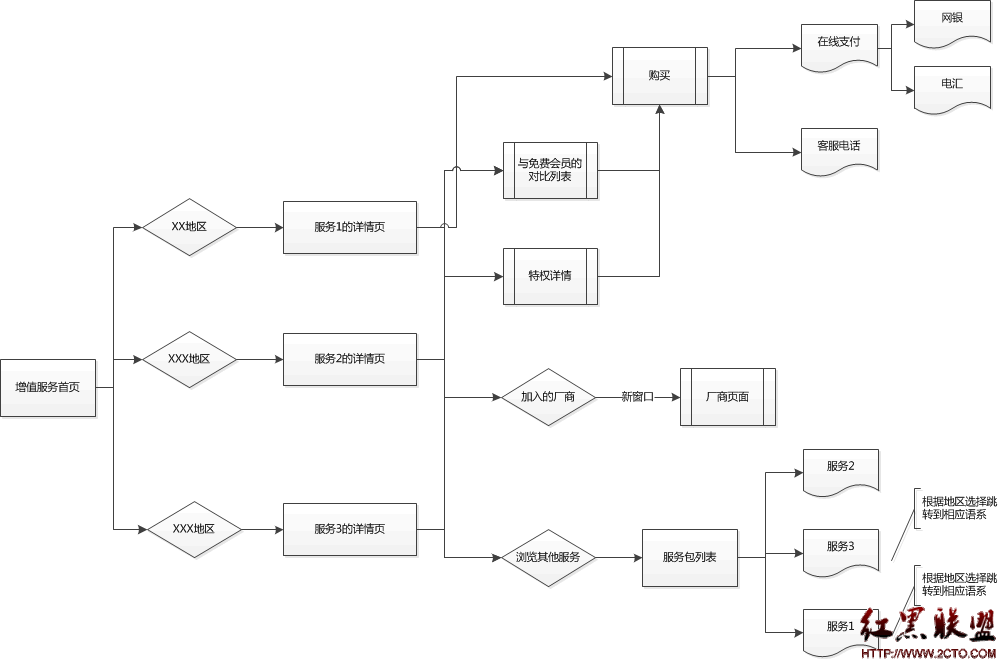
CSS3演绎神奇按钮效果(HTML5)
[html]<!doctype html>
<html>
<!-- author: @simurai -->
<head>
<title>Experimental -webkit-appearance:none styling</title>
<meta charset="utf-8">
<style>
/* This is just the basic styling for the whole page. */
/* Global ------------------------------------------------------ */
html {
font: 62.5%/1 "Lucida Sans Unicode","Lucida Grande",Verdana,Arial,Helvetica,sans-serif;
background-color: hsl(200,5%,15%);
background-size: 5px 5px;
background-image: -webkit-linear-gradient( 45deg, hsla(0,0%,0%,0) 0px,
hsla(0,0%,0%,.10) 50%,
hsla(0,0%,0%,0) 100% );
}
body {
margin: 0;
}
/* list ------------------------------------------------------ */
ul {
list-style: none;
padding: 50px 0;
margin: 0;
font-size: 2em;
text-align: center;
background-image: -webkit-linear-gradient( 0deg, hsla(0,0%,100%,0) 0px,
hsla(0,0%,100%,.09) 50%,
hsla(0,0%,100%,0) 100% );
}
ul li {
padding: 50px 0;
}
/* Aside ------------------------------------------------------ */
aside {
position: fixed;
top: 20px;
left: 20px;
}
aside button {
margin: 0;
padding: 10px ;
border: none;
border-radius: 5px;
font-weight: bold;
color: hsl(200,100%,60%);
background: hsla(0,0%,0%,.12);
cursor: pointer;
}
aside button:hover {
background: hsla(0,0%,0%,.2);
}
aside button:active {
-webkit-transform: translateY(1px);
}
/*
* umbrUI meter input by @simurai
*/
/* -------------- meter -------------- */
meter:nth-child(1) { -webkit-transform: translate(-50px, 50px) rotate(-90deg); }
meter:nth-child(2) { -webkit-transform: translate( -25px, 25px) rotate(-90deg); }
meter:nth-child(3) { -webkit-transform: translate( 0px, 0px) rotate(-90deg); }
meter:nth-child(4) { -webkit-transform: translate( 25px, -25px) rotate(-90deg); }
meter:nth-child(5) { -webkit-transform: translate( 50px, -50px) rotate(-90deg); }
meter {
-webkit-appearance: none;
position: relative;
display: block;
margin: 8px auto;
width: 100px;
height: 17px;
border-radius: 5px;
padding: 4px 5px 4px 5px;
box-sizing: border-box;
background: #000;
-webkit-box-shadow: -1px 0 0 hsla(0,0%,100%,.08);
-webkit-transform-origin: center 8px;
}
meter::-webkit-meter-bar {
background-color: hsl(200,10%,14%);
background-size: 2px 5px;
background-image: -webkit-linear-gradient( 0deg, hsla(0,0%,0%,.4) 1px, hsla(0,0%,0%,0) 1px ),
-webkit-linear-gradient( 90deg, hsla(0,0%,0%,1) 1px, hsla(0,0%,0%,0) 1px );
}
meter::-webkit-meter-optimum-value,
meter::-webkit-meter-suboptimum-value,
meter::-webkit-meter-even-less-good-value {
background-size: inherit;
background-image: inherit;
-webkit-box-shadow: 0 0 10px 2px hsla(200,100%,50%,.4);
-webkit-transition: width 1s cubic-bezier(.20, .10, .20, 1);
}
/* With these pseudo selectors you could change the colors when changing the value. */
meter::-webkit-meter-optimum-value { background-color: hsl(200,100%,50%); }
meter::-webkit-meter-suboptimum-value { background-color: hsl(200,100%,50%); }
meter::-webkit-meter-even-less-good-value { background-color: hsl(200,100%,50%); }
补充:web前端 , HTML 5 ,