[WPF] 如何在自己定义的style里动态绑定图片
这是我自己写的一个tabcontrol,然后我已经在里面嵌入了一张图片,我想请教一下各位,能不能写成一个通用的style.直接用在TabItem上面.因为TabItem上不包含图片,不知道怎么做才好
<TabItem Header="TabItem">WFP Style TabItem --------------------编程问答-------------------- 代码贴错了,复制多了...不好意思.只有下面这一点.
<TabItem.Style>
<Style TargetType="{x:Type TabItem}">
<Setter Property="Template">
<Setter.Value>
<ControlTemplate TargetType="{x:Type TabItem}">
<ControlTemplate.Resources>
<Storyboard x:Key="Storyboard1">
<ColorAnimationUsingKeyFrames Storyboard.TargetProperty="(Panel.Background).(SolidColorBrush.Color)"
Storyboard.TargetName="sp">
<EasingColorKeyFrame KeyTime="0" Value="White"/>
<EasingColorKeyFrame KeyTime="0:0:0.2" Value="#FFFFCE4E"/>
</ColorAnimationUsingKeyFrames>
</Storyboard>
</ControlTemplate.Resources>
<StackPanel x:Name="sp" Background="White">
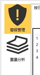
<Image Width="84" Height="70" Source="/Images/TabIcon/3.png" Margin="0,0,0,0" ></Image>
<Label Content="警报管理" HorizontalAlignment="Center"/>
</StackPanel>
<ControlTemplate.Triggers>
<Trigger Property="IsSelected" Value="True">
<Trigger.EnterActions>
<BeginStoryboard Storyboard="{StaticResource Storyboard1}"/>
</Trigger.EnterActions>
<Setter TargetName="sp" Property="Background" Value="#FFFFCE4E"></Setter>
</Trigger>
</ControlTemplate.Triggers>
</ControlTemplate>
</Setter.Value>
</Setter>
</Style>
</TabItem.Style>
<Grid Background="White">
<TabControl>
<TabItem Header="按日查看">
<Grid Background="White" Margin="0,8.163,0,0">
<Grid.ColumnDefinitions>
<ColumnDefinition Width="300" />
<ColumnDefinition Width="*" />
</Grid.ColumnDefinitions>
<ListView BorderBrush="Black" x:Name="listView1" BorderThickness="2" ItemsSource="{Binding}" Margin="0,39,0,0" Height="456">
<ListView.View>
<GridView>
<GridViewColumn Header="编号" DisplayMemberBinding="{Binding ID}" Width="80"/>
<GridViewColumn Header="起始时间" DisplayMemberBinding="{Binding BeginTime}" Width="110"/>
<GridViewColumn Header="结束时间" DisplayMemberBinding="{Binding EndTime}" Width="110"/>
</GridView>
</ListView.View>
</ListView>
<Grid Grid.Column="1" Height="456" Margin="0,39,0,0">
<Grid.RowDefinitions>
<RowDefinition Height="20" />
<RowDefinition Height="1*" />
<RowDefinition Height="1*" />
<RowDefinition Height="1*" />
<RowDefinition Height="1*" />
<RowDefinition Height="20" />
</Grid.RowDefinitions>
<Canvas SnapsToDevicePixels="True" x:Name="canvas1" Width="450" Height="50" Background="Gray" Grid.Column="1" Grid.Row="1" Panel.ZIndex="1">
<Canvas.ToolTip>
<Label Height="40" Width="100" Background="Gray" Content="关机" FontSize="15" FontWeight="ExtraBold" Foreground="White"/>
</Canvas.ToolTip>
</Canvas>
<Canvas SnapsToDevicePixels="True" x:Name="canvas2" Width="450" Height="50" Background="Gray" Grid.Column="1" Grid.Row="2" Panel.ZIndex="1">
<Canvas.ToolTip>
<Label Height="40" Width="100" Background="Gray" Content="关机" FontSize="15" FontWeight="ExtraBold" Foreground="White"/>
</Canvas.ToolTip>
</Canvas>
<Canvas SnapsToDevicePixels="True" x:Name="canvas3" Width="450" Height="50" Background="Gray" Grid.Column="1" Grid.Row="3" Panel.ZIndex="1">
<Canvas.ToolTip>
<Label Height="40" Width="100" Background="Gray" Content="关机" FontSize="15" FontWeight="ExtraBold" Foreground="White"/>
</Canvas.ToolTip>
</Canvas>
<Canvas SnapsToDevicePixels="True" x:Name="canvas4" Width="450" Height="50" Background="Gray" Grid.Column="1" Grid.Row="4" Panel.ZIndex="1">
<Canvas.ToolTip>
<Label Height="40" Width="100" Background="Gray" Content="关机" FontSize="15" FontWeight="ExtraBold" Foreground="White"/>
</Canvas.ToolTip>
</Canvas>
</Grid>
</Grid>
</TabItem>
<TabItem Header="按月查看">
</TabItem>
</TabControl>
</Grid>
</TabItem>
<TabItem.Style>--------------------编程问答-------------------- 请问如何把这个style写成通用的啊,图片由具体的时候再定.
<Style TargetType="{x:Type TabItem}">
<Setter Property="Template">
<Setter.Value>
<ControlTemplate TargetType="{x:Type TabItem}">
<ControlTemplate.Resources>
<Storyboard x:Key="Storyboard1">
<ColorAnimationUsingKeyFrames Storyboard.TargetProperty="(Panel.Background).(SolidColorBrush.Color)"
Storyboard.TargetName="sp">
<EasingColorKeyFrame KeyTime="0" Value="White"/>
<EasingColorKeyFrame KeyTime="0:0:0.2" Value="#FFFFCE4E"/>
</ColorAnimationUsingKeyFrames>
</Storyboard>
</ControlTemplate.Resources>
<StackPanel x:Name="sp" Background="White">
<Image Width="84" Height="70" Source="/Images/TabIcon/3.png" Margin="0,0,0,0" ></Image>
<Label Content="警报管理" HorizontalAlignment="Center"/>
</StackPanel>
<ControlTemplate.Triggers>
<Trigger Property="IsSelected" Value="True">
<Trigger.EnterActions>
<BeginStoryboard Storyboard="{StaticResource Storyboard1}"/>
</Trigger.EnterActions>
<Setter TargetName="sp" Property="Background" Value="#FFFFCE4E"></Setter>
</Trigger>
</ControlTemplate.Triggers>
</ControlTemplate>
</Setter.Value>
</Setter>
</Style>
</TabItem.Style>
 希望大家给点建议和方法
--------------------编程问答--------------------
我说的不够详细吗?我就是想把这一行
希望大家给点建议和方法
--------------------编程问答--------------------
我说的不够详细吗?我就是想把这一行<Image Width="84" Height="70" Source="/Images/TabIcon/3.png" Margin="0,0,0,0" ></Image>
写的更加具有适用性,能够根据具体的按钮改图片 --------------------编程问答-------------------- 可以做一个用户控件 控件添加属性去绑定图片,TabItem的模版就是这个用户空间
补充:.NET技术 , C#